Selecting Spring Shades – The Art of Picking Perfect Paint!
Finally! Spring has arrrived (sort of) and I, like many of you lovely readers will be Spring cleaning! This usually involves various visits to the tip and a refresh by way of a new lick of paint to some of my rooms. Paint is a tricky subject. So many colours, so many shades, so many finishes – where to begin?! With so many wonderful companies to choose from (My personal faves? Mylands, Little Greene, Zoffany, Designers Guild and the ubiquitous Farrow & Ball) you are completely spoilt for choice.
But how many of us have picked a paint colour only to find when it is on the wall it is not what you had hoped it would be?
Well I thought I would put together a quick list of how best to select your paints and how to avoid common mistakes.
1.Go with your gut!
This is your home, with your much loved collection of everything you hold dear, so why are you thinking of doing something entirely different just to be different? Go with your instincts and trust what you like. For example, I personally like cooler shades, so most colours that have blue undertones suit my style – I stick with this and never go wrong!
2. Buy a sample pot
This sounds like a very obvious thing to say, but you won’t believe how many homes I have been to with the wrong choice on the walls where the colour has been chosen from a printed paint chart or a brochure. I always recommend to my clients to buy a paint pot and use the whole pot to paint a large white piece of card with two coats (you can buy an A1 board from your local art supply shop for this for about £4.00 a sheet). This means you get a large area of the true colour AND you can move it around the room without the walls becoming a patchwork of paint splodges! You also get to see how the colour behaves in different lights at different times of the day; you may love it in the daylight, but not be so keen once the light switch is flicked. Something to consider…
3. Don’t follow the crowd!
So you have been to your friends home and love the colour on their walls. HOLD YOUR HORSES! A colour may look absolutely beautiful in one room, and then look completely different in another. Why? This is primarily down to the light you have coming into each room and how the pigments react to it. Your windows may be facing North, whilst your friends are facing South. The impact of a warm or cool light on the walls can change the look of a colour entirely. See Step 2!
4. Sticking with the correct brand
Choosing a beautiful colour from a ‘designer’ brand and then getting the paint mixed by a less expensive company to match this will always end up in disappointment. No two paint companies are the same and each uses different quantities of pigment, solvents and binders to create their paints. It can also depend on the level of coverage and finish, so this can change a paint colour quite drastically. If you want to keep costs down make sure you get a sample pot of the actual paint you will be using – go back to Step 2!!
5. The Finished Result
So you have spent an entire weekend painting and you take a step back and are starting to think you have made a terrible mistake. Don’t forget to put everything back into the room, including your curtains, pictures, furniture and rugs. If you have followed the instructions above everything will be fine. Just remember that the colour will look less dominating when it is levelled out with your belongings around it.
Hopefully this should help create a little harmony when you are up a ladder with your roller at the weekend, but if all else fails call an Interior Designer! 😉
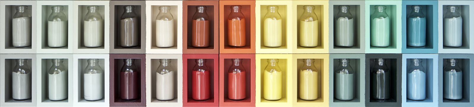
Main Image Courtesy of Farrow & Ball
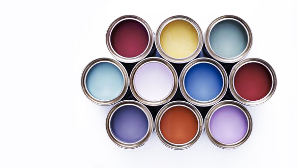
Inset image: Nato Welton